We can all agree it is generally a very nice surprise when something is under-promised and over-delivered. In making today’s piece, I was delighted by a last-minute addition to the work; a true after-thought that was intended to be of little consequence. Today is a real treat as I will only force you to read a single paragraph before showing you the image, enjoy!
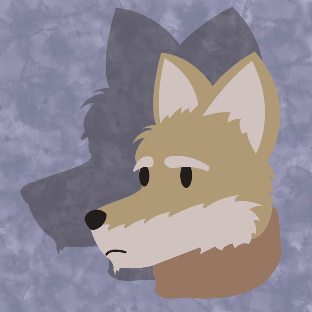
I began this image with a grey, mottled background. i absolutely love that watercolor style. I learned from yesterday’s piece that I did not like using a single texture across every part of a piece; too uniform. I like there to be a single, bold, textured part of the image.
Nerd-Speak Ensues
I had thought that an orange and white fox, even at low saturation, would show brilliantly on top of a grey backdrop, but it did not. You can see how much the hackles on the foxes’ neck blend, and how difficult it is to find the detail of those points and curves. I decided to place a color filter over the background in the hopes I could find a hue that would be a little more contrasting, and make the fox pop without needing to use any heavily saturated colors. Some tints were of course more effective than others, but I fell in love with the blueish hue supporting the orange of the fox, and decided the blue shall remain, and another method of accent must be found.
My primary goal with this piece, in terms of style, was to not use any contour lines. At this point I did not think I was going to find another way. I made a duplicate of the fox, turned it black and combined all of the shapes, and scaled it up a bit in the attempt to get an initially perfect outline with very little work. This could have been done much more simply, as Inkscape allows you to give a shape an outline and adjust line thickness. However, I wanted to play with skewing the outline, to make it just a little more interesting.
A vector shape is comprised of points and angles. When scaling the image, all points are scaled from the origin of the shape. The origin of the shape can be adjusted, but by default is the center of the shape’s bounding-box. The bounding box is the center of the furthest extents of the shapes points. Scaling from the bounding box center resulted in a very inaccurate outline.
This was fine, for my purposes, as I was wanting something imperfect from the beginning. I started stretching it around, and quickly thought this would look better as a shadow. Soon enough I had the image you see now, and I simply played a little with the positioning and scales.
Can We Get to the Point?
Once the image was finalized, I stared at it for a good few minutes. I always worry that my works look lazy, as though I just could not be bothered to take them any further. I need to shed that fear, because it will take me further from what I currently seek, my particular style. There is also no harm in experimenting, as art is forever a college student living among many other college students…
What I was contemplating was how, to me, at that moment in time, the fox simply looked to be lacking any depth. I love to throw around the term ‘flat’. Make no mistake, it is a flat image. I am simply stating it looked too flat. As my eyes drifted to the shadow, though, I thought how marvelous it was that the shadow looked, in comparison, so detailed! It was my expectation that a shape comprised of a single line or color could never look as detailed as one comprised of multiple. To the contrary, the shadow does so much with what little it has to work with. This is likely why I was always so drawn to the Sunday morning comics as a child. These were typically heavily-inked and contoured drawings.
Having stared at this image a bit longer, I am quite happy with it. It is what I set out to accomplish. Something strongly me with something unfamiliar woven in. Today’s post was a good deal less sarcastic than previous entries as this simple, unintentional focus on contrast really had me pondering about where to go from here, artistically.

Leave a comment