The treasure’s grand, but in my hand,
The coldest steel, tis all I feel,
By dead of night, I’ll stalk and fight,
And fore my grin, ye’ll meet yer end,
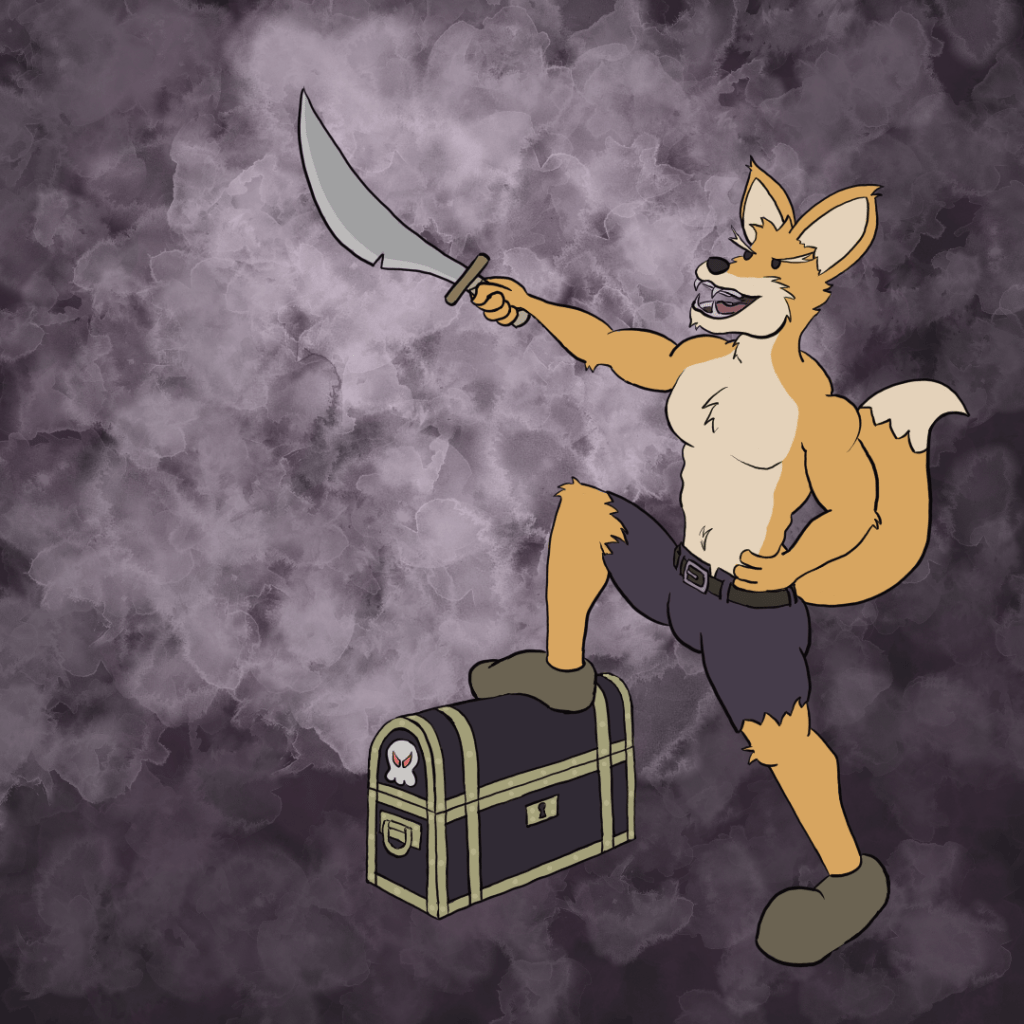
There are so many things wrong with this image, I wouldn’t have time to list them all here. Despite the flaws, this is instantly my favorite piece I have ever done. There is no competition; there is no extra consideration.
I spend a fair bit of time looking over my old works each day, trying to weigh out what I need to improve on the most, what I will have the fortitude to attempt, and what I believe I will have time to tackle. Looking over yesterday’s piece in particular, I did not realize how dark the whole piece is. There are no highlights. That was unintentionally deliberate (yup). My biggest desire, and I truly do not have a root reason sticking out in my mind, is to avoid over-saturated colors. It is just some quirky, personal goal.
There are multiple formats available when working with colors, and we will glance at two of them; RGB and HSV. RGB stands for red, green and blue. Each of the three channels can (generally) go from 0 to 1 or 0 to 255, depending on the software and system architecture. Mixing those values gives you a full spectrum of colors. HSV stands for hue, saturation and value. Hue gives you a rainbow of colors to choose from at full ‘brightness’. Saturation is the amount of that color you want to add in. Value (or light in HSL) is how bright or dark that color is (if the value is at 0, how close to black or white the color is).
Now, I do not know why it took me years upon years to mentally separate saturation from value, but that was the hang-up I was facing. It is fine if I want to avoid high saturation, but that does not mean an image will do well (doesn’t mean it won’t) without some variety in the values of the various colors used. Yesterday’s piece was all extremely low in value, and because of that, The piece looks dull and simply unlit. So, today’s piece followed the trope of ‘light defeating the darkness’, huzzah!
That decision alone makes this piece so eye-catching (to me, at least). That was not the only change I was determined to implement, though. I keep on speaking of how much I love the water-color style, and I think I will make heavy use of it going forward. I wanted to do more with it than I have previously, but still keep it limited to the background. I wanted the watercolor-ed area to ‘pop’ more, and I had an idea on how I wanted to do that after reading a certain piece yesterday on my lunch break.
The idea was born from an article (a very good read, particularly for eager artists) titled ‘Typical Artists’ Problems and How to Defeat Them’, by BeckyKidus on DeviantArt. There was a particular point that stuck out to me:
Get the darks down first.
I am ‘a lineart guy’. You mean to tell me people think that far ahead in regards to colors? I was very eager to try this, and it really helped me to think of the composition as a whole. By no means did I apply the concept in any masterful fashion, and certainly my ‘style’ of flat-shading does not readily lend itself to the workflow of progressing through values of colors, but it helped me to determine which part of the piece I wanted to accentuate. The bulk of the ‘action’ in the foxes’ pose is in the raised sword, toothy countenance and raised foot. To attempt to draw the eye there more naturally, that is where I placed more light values, and I pushed the darks out to the bottom and right.
I will continue to work on more interesting gestures, but that one is difficult simply for the sake of learning anatomy and proportions. I am fine with this pose, but it is still very stiff. The back leg should be a little more bent, the chest should be further puffed out, etc.
I am so overly pleased with myself on this piece, I am going to use the term chuffed, and I will have an obnoxious case of ‘the feel goods’ the rest of the day. If you do not seek any unsolicited advice on topics I know nothing about, today is the day to avoid me.

Leave a comment