Today it took me over an hour to decide on a joke, and even then it was born from picking a random pose and adding in details as I went. ‘What’s your process?’ is a very frequent artist-to-artist question you see, and I have never stopped to think about mine. Some days, I just have a funny thought pop in my head, and I mentally rearrange characters and words until I am pleased with the result. Other days it takes some work and requires powering through the ol’ artistic block.
I don’t believe I have ‘a process’ at this moment. I take of advantage of whatever comes first; the scene, the situation, the words, the shapes, the colors. I suppose from that we can say my process is to keep moving forward. With my little intro out of the way, I want to talk more about colors today.
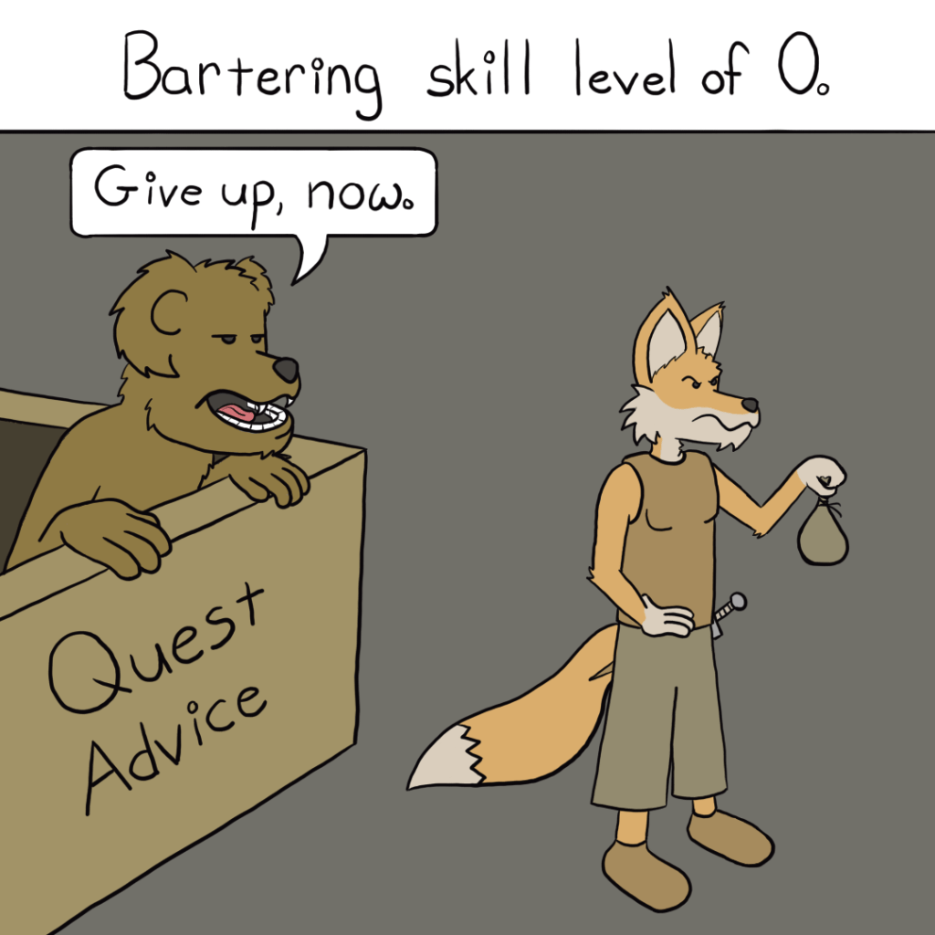
I like the general shade of orange I use for the fox’s primary color, but the secondary, lighter color needs to make way to something even lighter. Each day I tell myself to make it a lighter value than yesterday. Each day I really think, ‘This is going to be way too bright’. Each day it winds up being roughly the same value as the day before. I really cannot decide if that means I am actually pleased with this value, based on my consistency, or if I am just being stubborn and I should just make the secondary color white.
I had read long ago that one should avoid using pure black or white on screens; they are ‘unnatural’. Don’t know how that pertains to my anthropomorphic, human-language-speaking animals in their medieval fantasy world drawn in a comic style. I have never put much stock in not using pure black simply because it provides such a clean outline. The white, though, I have largely avoided. It just feels too harsh on the eyes.
I have given in and started using pure white, as it feels like it fits so well in an image with no shading; it really pops. I also feel like the more greyish colors behind text and speech bubbles just makes things feel really dull. So why can I not get myself to use white on the fox?
Finally, the background. I could not get something I was pleased with today. The watercolor style just distracted from the foreground, no matter what colors I went with. I tried a more frantic style, with hastily scratched lines, and alpha-masked layers of various colors scratched on top, but it all just felt like it was too much. I took a very large step back, and settled on a very dull, muted color to keep things simple and allow the foreground to do all the work.

Leave a comment